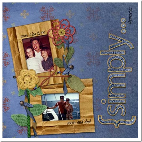
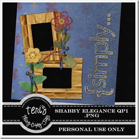
This is a new kit from lbCreations called Shabby Elegance. I liked the color choice and how she was able to incorporate a little shabby with the chic...so to speak. On the first QP I thought of the word "Simple" or "Simply" right off the beginning so I went with "Simply..." because, number one, I love the alpha's that came with the kit and #2, I felt that you can add what ever message underneath the word simply. In my case, I added memories....These were some pics of my family as I remember them growing up and I am in the process of scanning them, so they were fresh on my mind.
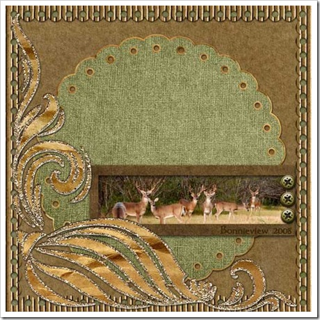
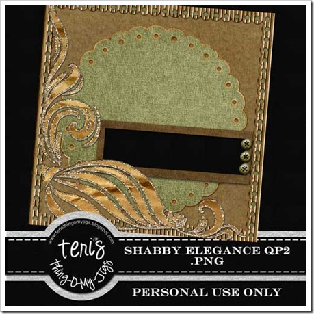
In the second layout, I wanted to use a little more Shabby look and I loved the glittered swirls. I like the long frame that can be used to isolate just part of a picture to really showcase your photo. Hope you can use these for something! See how a kit can make 2 completely different pages? Now, run on over to check out Babette's things at http://lbcreations.blogspot.com/ or visit her at http://www.divinedigital.com/ to see all her great kits.


3 comments:
Oh love the pages you Made! Great job!
OM Gosh I came looking for a blog train and am having fun surfing your blog. T4S
Gorgeous! Thanks!!
Post a Comment